
I think I owe you an explanation about the logo
An artboard filled with Experimental Jetset, MoMa rebrand concepts, immaculate, smoothed, infinite expanses of white and well-proportioned rectangles, housing negative space and art. I’d wanted a project like this for years. Coveted it, even.
Part 1 - Must be well kerned
An artboard filled with Experimental Jetset, MoMa rebrand concepts, immaculate, smoothed, infinite expanses of white and well-proportioned rectangles, housing negative space and art. I’d wanted a project like this for years. Coveted it, even.
You know this type of project, the one that everyone else seems to be doing but you - the fashion brand, the lighting company, the Scandinavian-Italian faucet startup. Nike, I guess, because who else?
Every pixel oozes with taste.
“Design for designers” is what they call it. Design that is meant to be thrown back into the masses of trendsetters, king-makers, blog-writers. To sit beside the ironically self-aware wine, the unabashed paper sample books, the pet project from that student who will SURELY get a D&AD pencil from their AR recreation of famous Paul Rand logos.
For almost a year now, Todd, Patrick and I had been chipping away at revitalizing the Canadian Design Resource: a latent collection of artifacts from Canadian designers.
Renamed to Nor, and christened with a new mandate, I found myself at that golden junction of a conceptual, cultural, and aesthetically-empowered project.
I’m left looking over the edge into what should be my speciality: branding.
What had started as an earnest and ongoing casual collection of designers and their creations had taken on a new life: one that was a little allergic to its previous incarnation. The Resource, dressed in a welcome-and-earnest red and nostalgic Honest Ed-style typography, lurked behind Nor.
When this chance to design for the design industry arrived (or I suppose was forcefully willed into existence), the natural response is, of course, pure abject terror.
Yes, I am working on a collection of design objects. And, why yes, it is something of a museum, or cultural thing. And, well, yes. Maybe we do need a logo.
Christ.
Must be iconic. Must be bold. Must be larger than life, push the boundaries. Must be strong, a force to be reckoned with, tell a story. Must be familiar. And never seen before. Nothing less than brilliant. Must work well in motion. Must use a typeface I haven’t used before. Must work on merch. Must work small sizes. Must establish a legacy. Sit up there with the greats.
Must be well kerned.
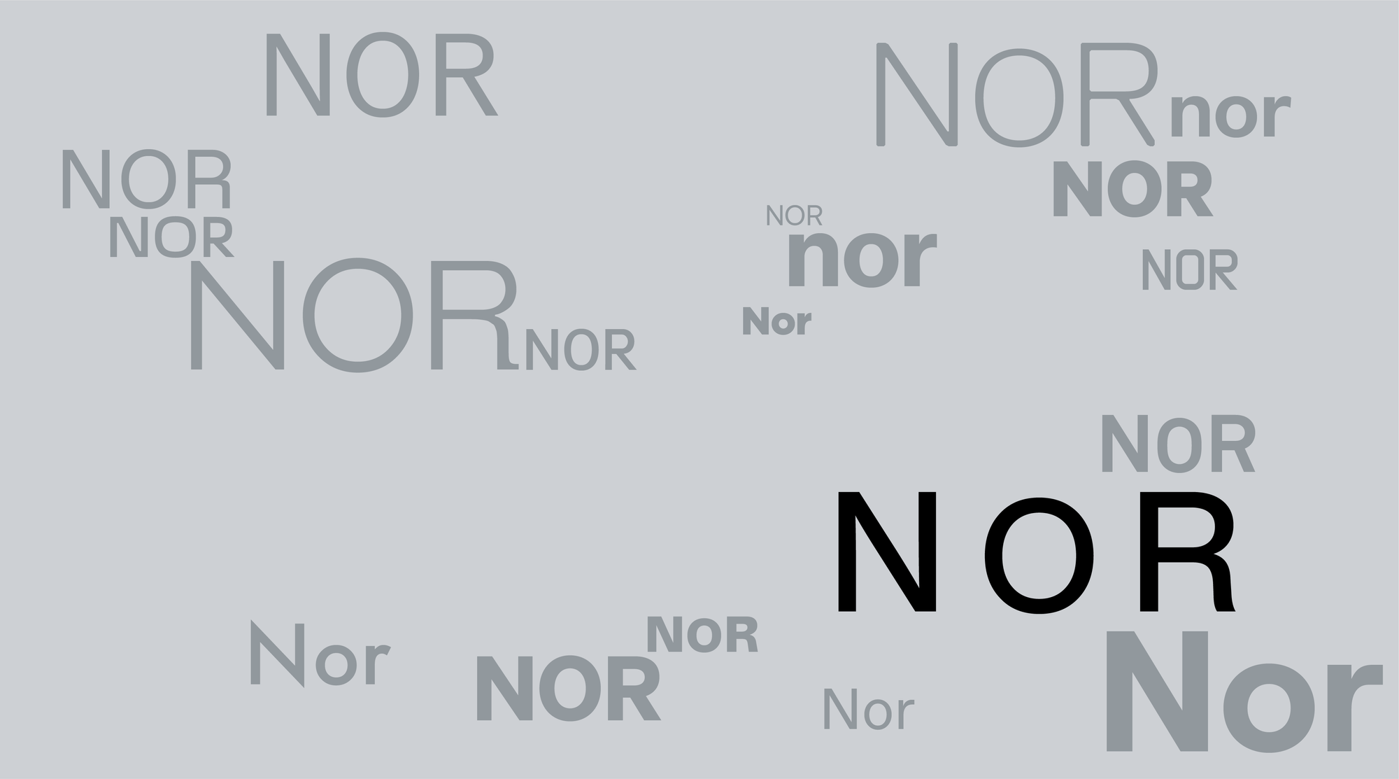
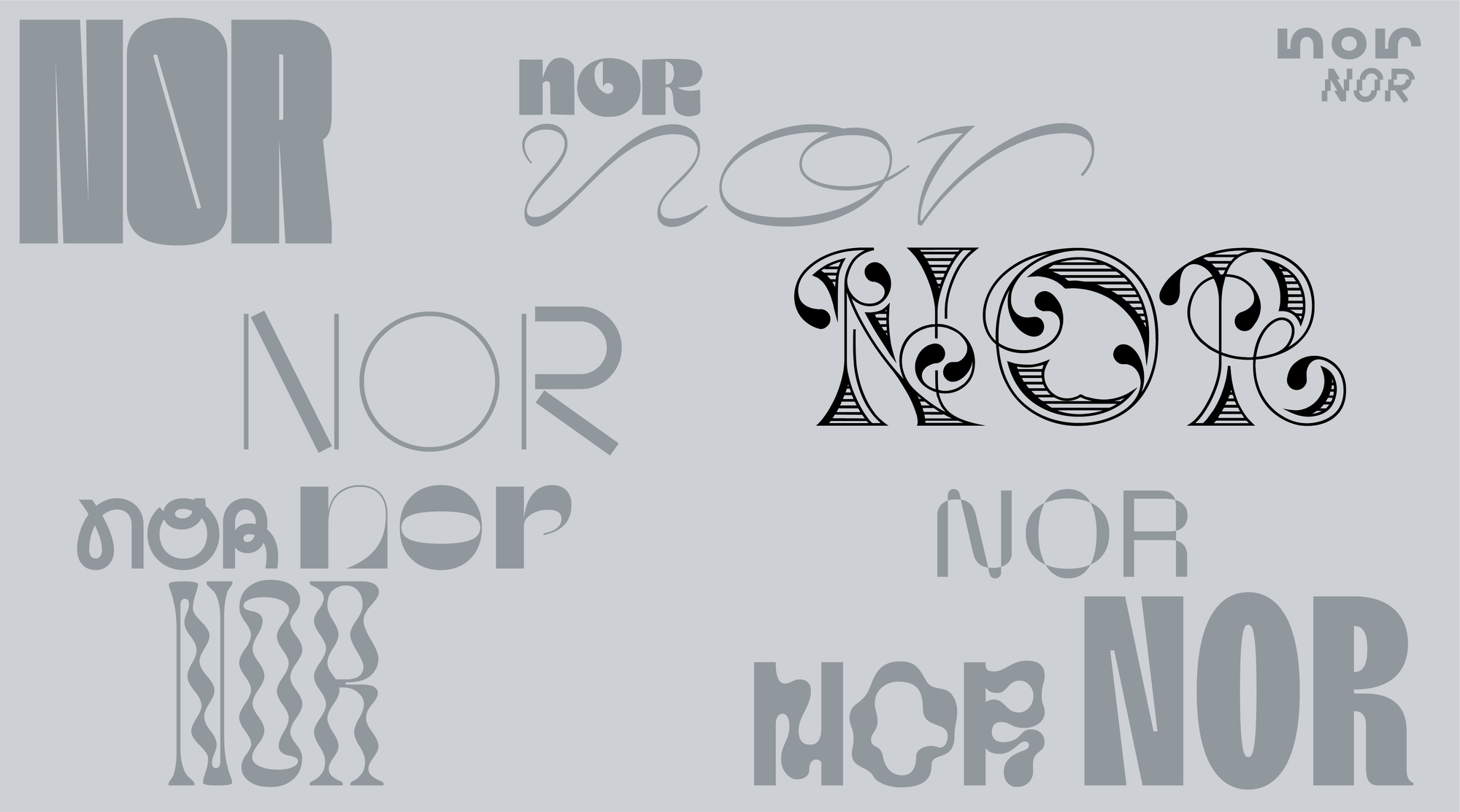
Panning through a bookmarked list of type foundries, systematically rolling NOR nor Nor through each one, screen-grabbing the interesting ones. Some with more angular cuts on the N, a tapered leg on the R.
Is modernity a cop-out? Why do we always end up here?
The PR releases say bold, but the output is expected. Within tolerance. “In the category”, the strategist might say.
The visual cues are actually easier to swallow at this point: Grid. Sans serif. Black and white. All caps.
Maybe it’s a control freak’s paradise: You get the ambiguity of being mysterious and absolutely in control, and the simultaneous opportunity to pretend that you’re not. The extra negative space means that you’re just the messenger.
Not culpable.
Part 2 - The Most Absolute Wrong Thing
Can the project afford to be divisive? Does it need to appease?
Do I have the courage to be disliked?
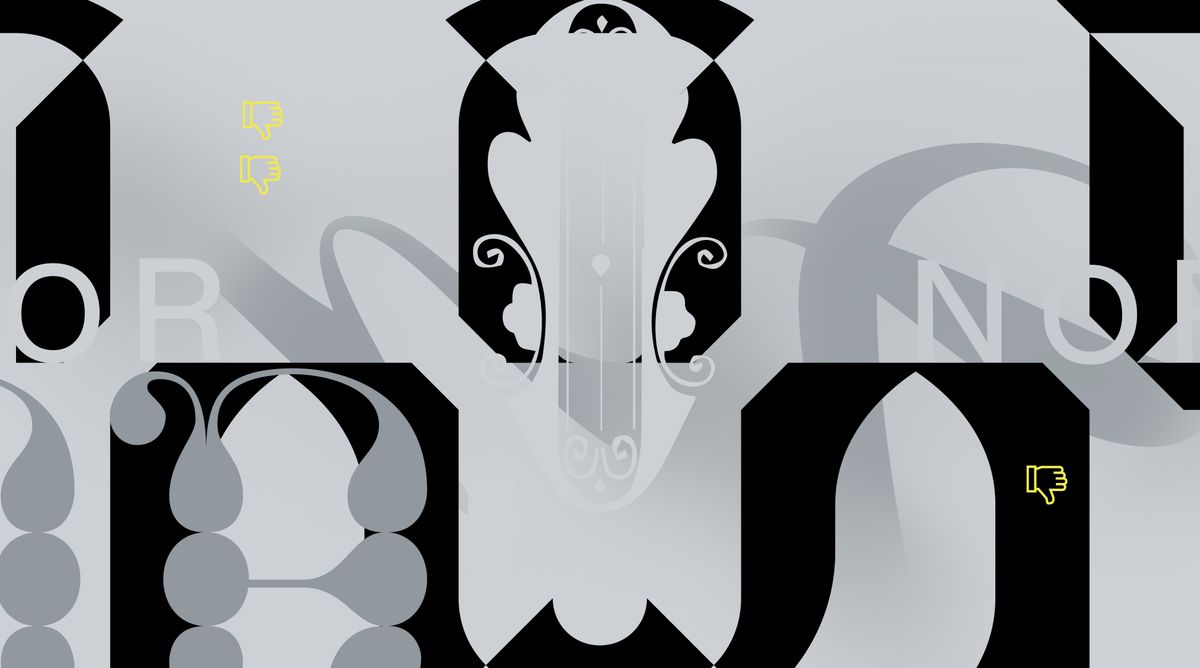
The artboard is locked and loaded with Helvetica(s). Having finally arrived at my timeless, modern, institutional NOR, victory is a little hollow.
What’s the stupidest thing I could do with this logo? The most absolute wrong thing?
I collect the trendy oddballs: extreme trapping, inverse stress, mixed case, drop-shadowed, those wibbly things.
Maybe it’s not about the logo at all, but a wild, moving grid system. Do we have budget to pull off some 3D moving something-or-other, bypassing this existential dread entirely by making it scream through a sizzle reel set to music?
But what, really am I saying with these trends? Besides eccentricity? Besides chasing cool?
Can we be so bad, it’s good?
What does a useless logo look like? What if I just break every single rule about “good logos” ever? Will I go to Designer Jail if I open dafont.com?
What would offend Adolf Loos the most?
Maybe he runs Designer Jail these days.
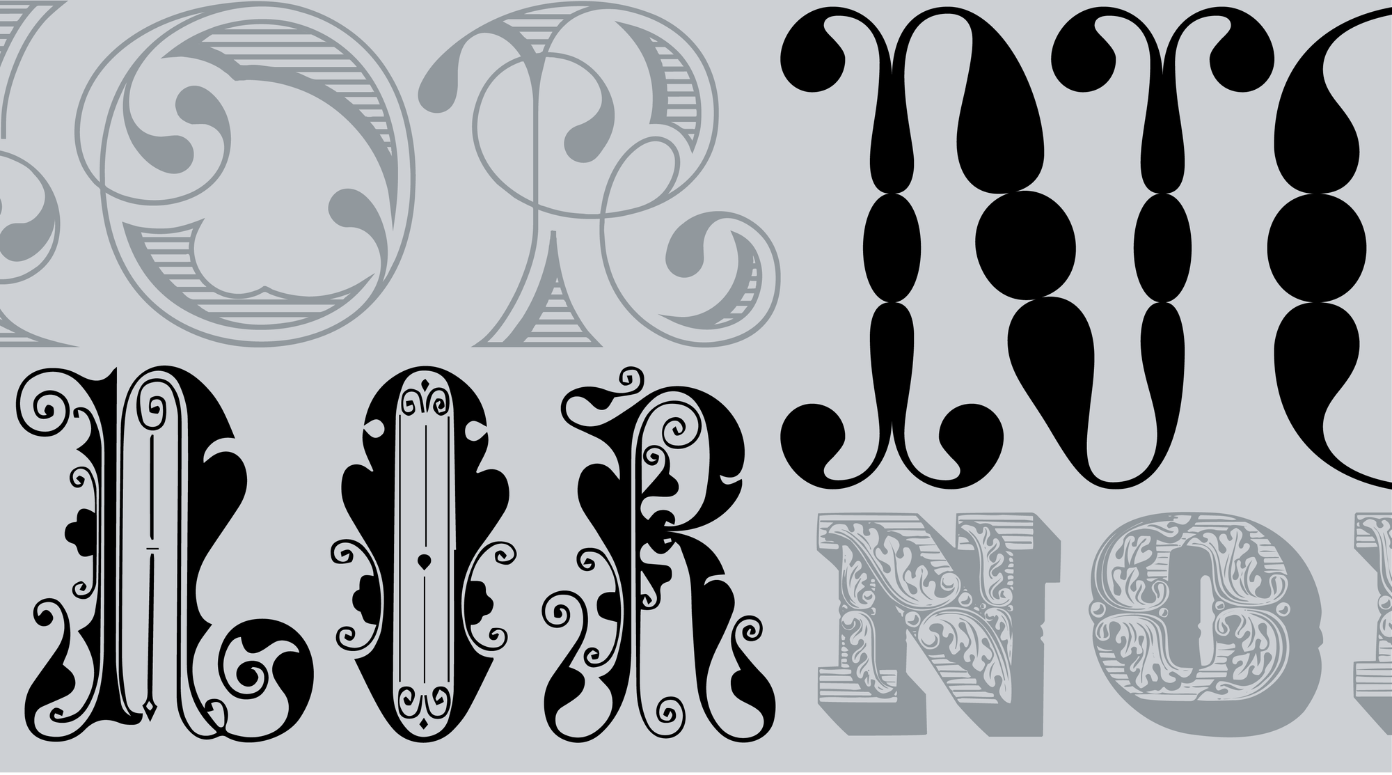
There’s something oddly beautiful about these letters. The ones that came before (nay without, or in absence of, or predating the concept of…) modernism. They have personality.
Having survived an apocalypse all their own, the swirls and flowers and textures of the Victorian, the Art Nouveau, and the terminally ornamented seem to take on a different aura.
In the era of straight-faced minimalism, these swirly, eccentric typefaces had long been relegated to specific places in the contemporary design repertoire: historical pastiche, the world of delicatessens, novelty, or postmodern irony.
Suddenly dropped into a modular grid, in stark black and white on retina screens, they sit up straight, and change the atmosphere in the room. Their moral dubiousness, the claims of intellectual and cultural rot that had been heaved on them—it all disappears. The arresting thick-thin contrasts, the giddying baubles, the mesmerizing curves remain.
Is it better to be honest about our complexity, or to sand it smooth?
“So I’m a little terrified.” An excellent opening line to any client presentation.
“I know there are high expectations in the project, since it’s quite visible. Design for designers can always be a bit intense.
The most obvious first step is to look at the minimalist approach, which I started over here. I think we could use some grids and interesting lock-ups to create something interesting…
But after I did that, I started to wonder what doing the exact opposite would be like. What making the most wrong option would be, and what it would look like. and… I'm kind of into it.”
“I like that this stuff is completely wrong. It’s interesting.”
“Yeah, there’s something happening with that in a good way.”
“What we’re not interested in is the Helvetica stuff. Like, whatever.”
On long walks in the evenings, I had been listening to podcasts about the anthropocene.
The anthropocene marinated every conversation at the time, puncturing through public consciousness from academia.
The weight of it, the monolith of systemic futility. The sad monotony of minimalist concrete blocks.
Design and capitalism, linked arm-in-arm together.
Smooth out the edges. Reduce friction.
Scrollwork painstakingly stitched around the hem of a jacket.
Large flourishing drop caps. illuminated by candlelight.
Flowers growing through the cracks of concrete.
Once again, at 3am, clicking idly through every type foundry Google will supply me. NOR. NOR. NOR. Next. No. NOR.
In one of the unassuming corners of the internet this odd, modular, chiseled-and-shadowed-font shows up: NT Guru.
Strong lines. Almost purely graphic forms. Fatefully equipped with a tertiary layer of optional printer’s flowers.
I spend a lot of time thinking about Certeau, and of private subversions of systems. Of the things that can’t be measured or quantified. Of inner textures.
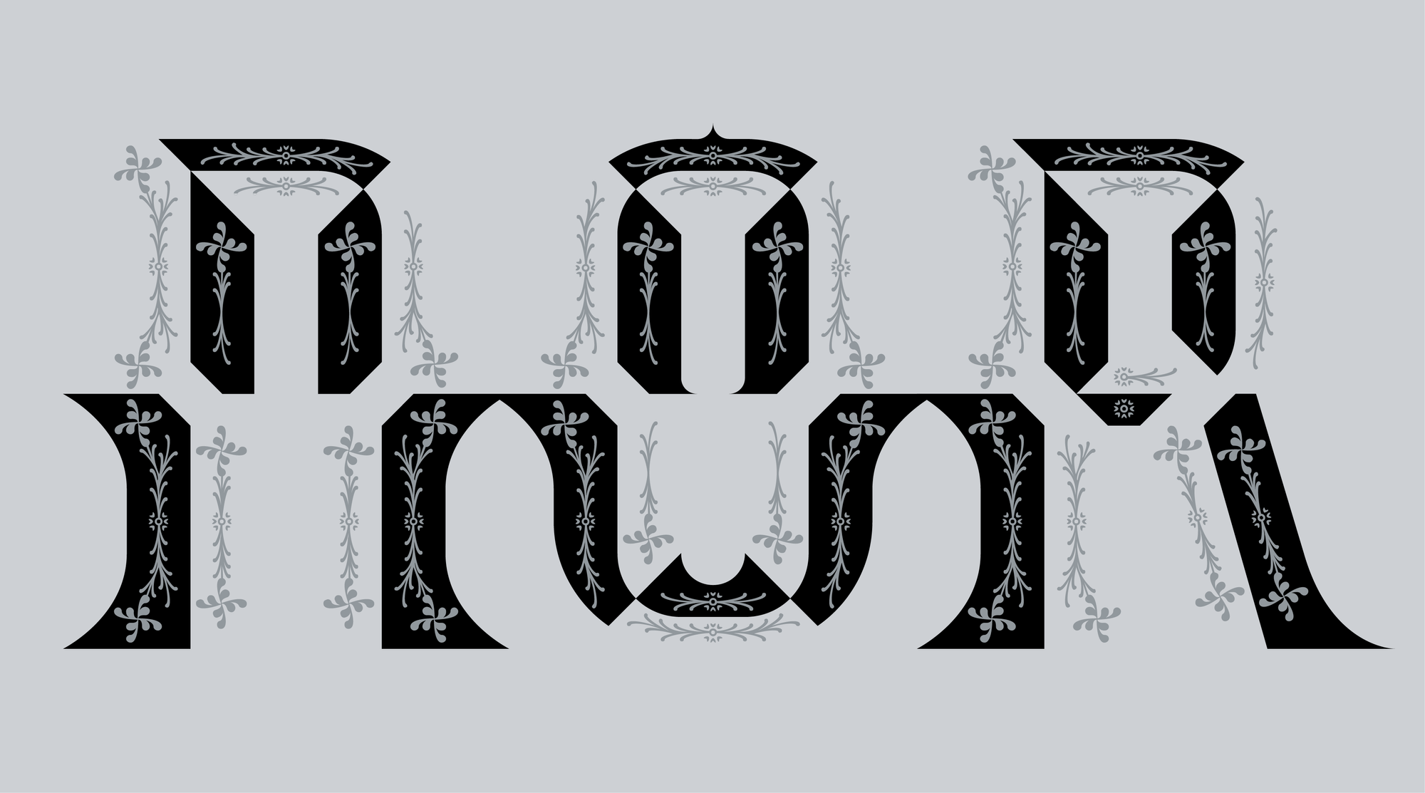
Patient collaborators. Another zoom call—the third round of rooting about. In truth, I stopped looking after finding NT Guru. Sometimes an option closes the doors to all other rooms.
“I want to jump over to the one that interests me. All of these weirdos have some stuff going on - some of them are more brutalist. Some of them are a bit trendy. but this one has really caught my eye.”
“Oh yeah.” A light chuckle.
“Yeah, that’s interesting.”
“I put it in some of these really loose layouts and sketches to show how it can come together. But I think this is the one. It feels so intense, so singular.”
“It’s engrossing. It’s wild, yeah. Wow.”
“To me, there’s something compelling about it - the strong lines feel like the built environment, and then these things here, like ornamentation, craft, the natural world. At tension, forced together.”
“I can’t stop looking at it.”
“Yeah, this is it.”
Part 3 - I’m going to be a shit client
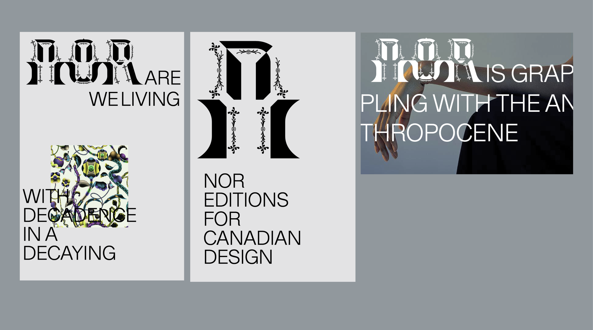
“The big theme of this logo is the tension between these raw, brutalist, repeatable forms and their opposition. These forms symbolize the built world, a monolithic interpretation of design. Being fused with its opposite: the unscalable, the fussy, the natural world.
The most radical and subversive thing available to us in a capitalist machine is the refusal to scale. To be purposeless. To ornament and decorate.”
Julien Priez is a patient collaborator. The wildly talented ones are always patient. Having discovered his work with High on Type during my time in Amsterdam, and watching it from afar - I had a feeling he was one of the few designers in the world who could handle this project. With my talents in hand-lettering limited, I was excited to bring in a fresh perspective.
“It’s a conceptual lift. We don’t fully know what we’re going for - it’s going to be some guesswork.
All we know is that it can’t feel mechanical. It also can’t lean on the old world, like printer’s flowers. And it can’t reappropriate or appropriate from the known world, or from other cultures. It can't reference Western symbols, or things like the original printers flowers.
“Alien,” I stress on the briefing call. “Not mechanical. Organic.”
“But,” I admit, “It’s going to be a hard one. I’m going to be a shit client, because it’s an ‘I’ll know it when I see it situation.’”
I continue reading the brief:
“Conceptually the logo design to-date aims to be provocative. The clash between the brutish 'mechanical' forms and the delicate, organic lines is deliberate and intends to create tension.
The nonsensical pairing of these forms should feel both 'alien' and slightly jarring.”
• Audacious
• Provocative
• Intellectual
• Contrarian
Any questions?”
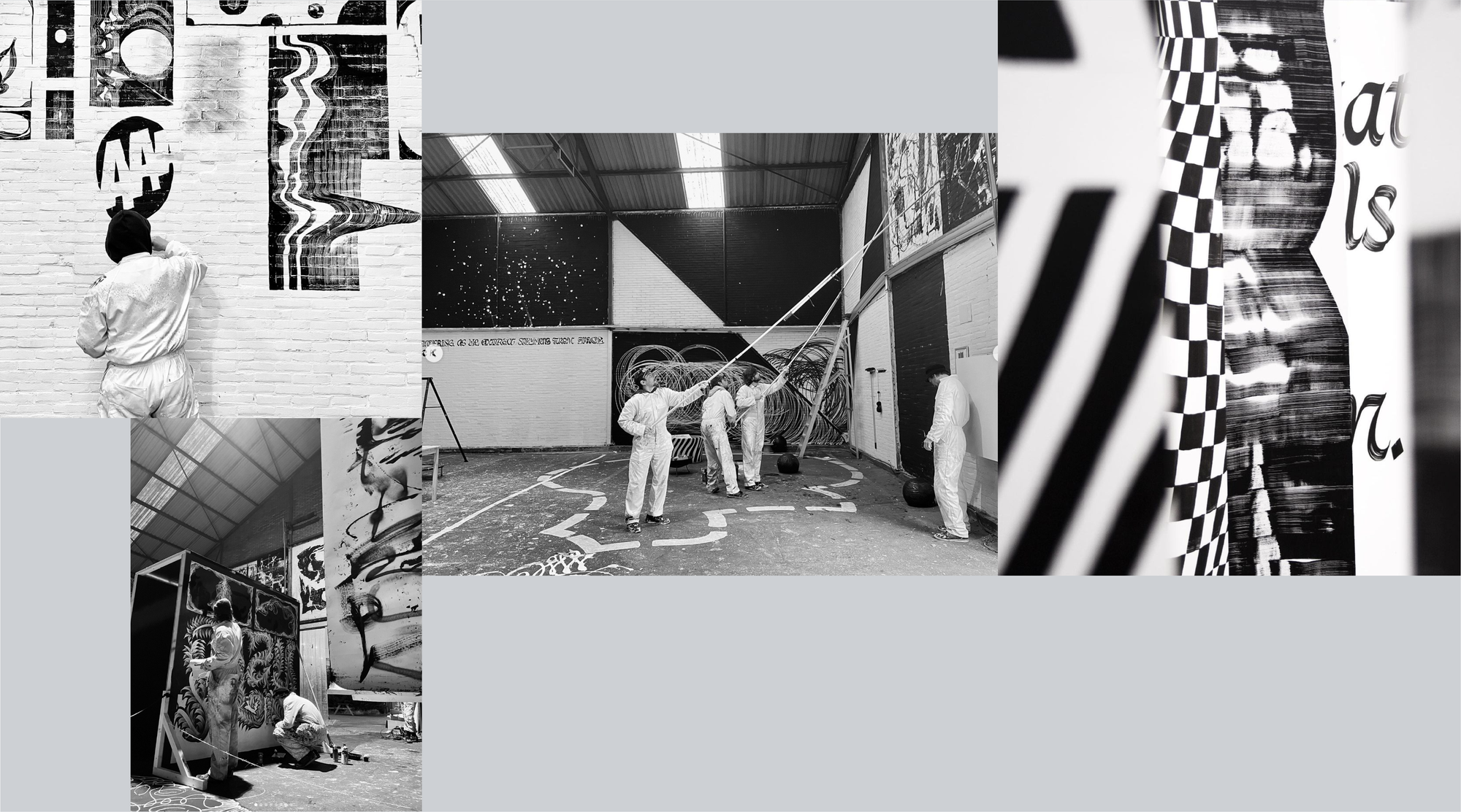
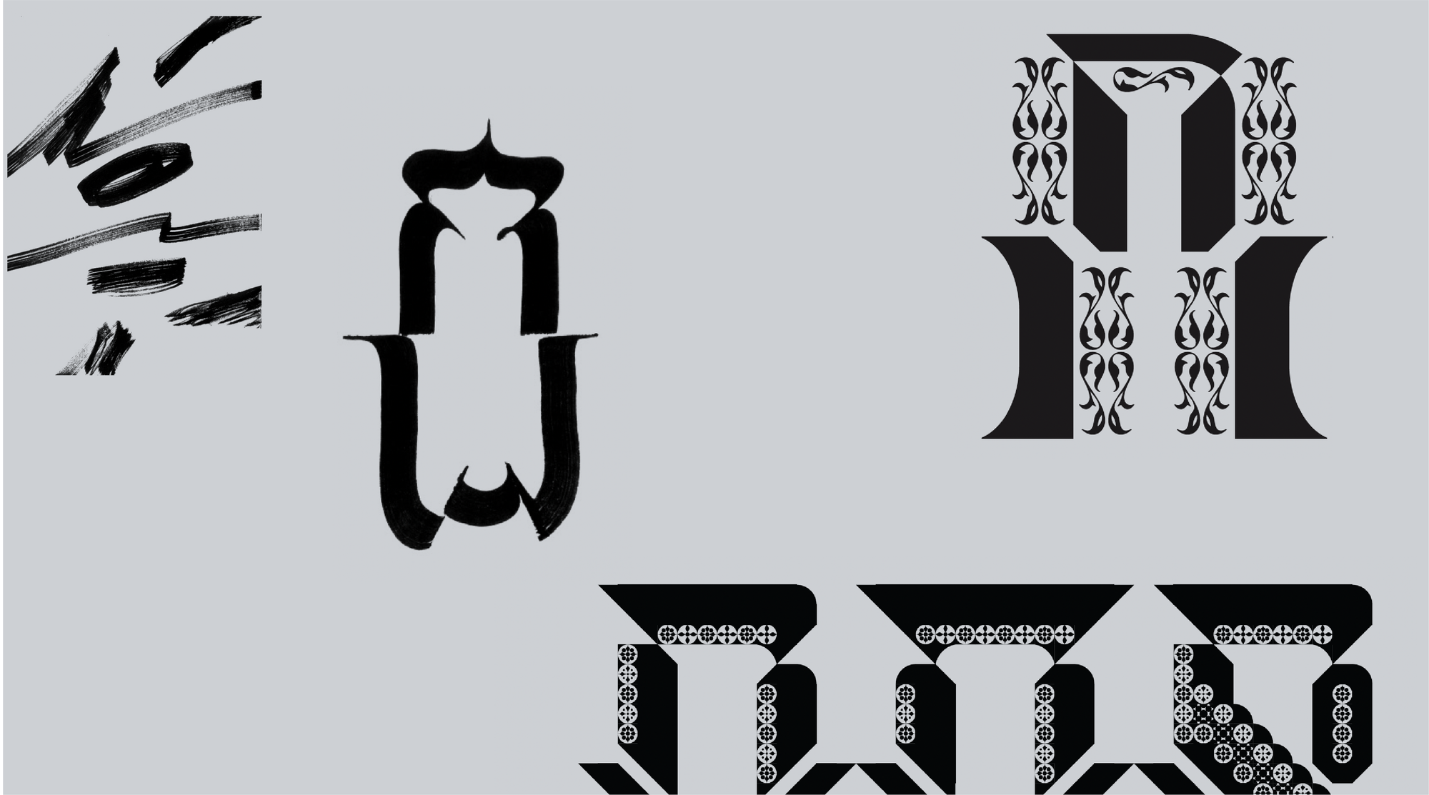
We meet for lunch at the Glasfabriek. Julien has made a rare trip from Paris to Rotterdam. But a trip worth making: Julien and his collaborators have secured an entire abandoned glass factory’s warehouse to paint according to their whims.
The ladders and swings and lifts, tennis rackets covered in black paint: A literal typographic playground.
Stories-high walls of the abandoned factory covered with wild, swooshing calligraphy.
“Yeah, bring this into the project.”
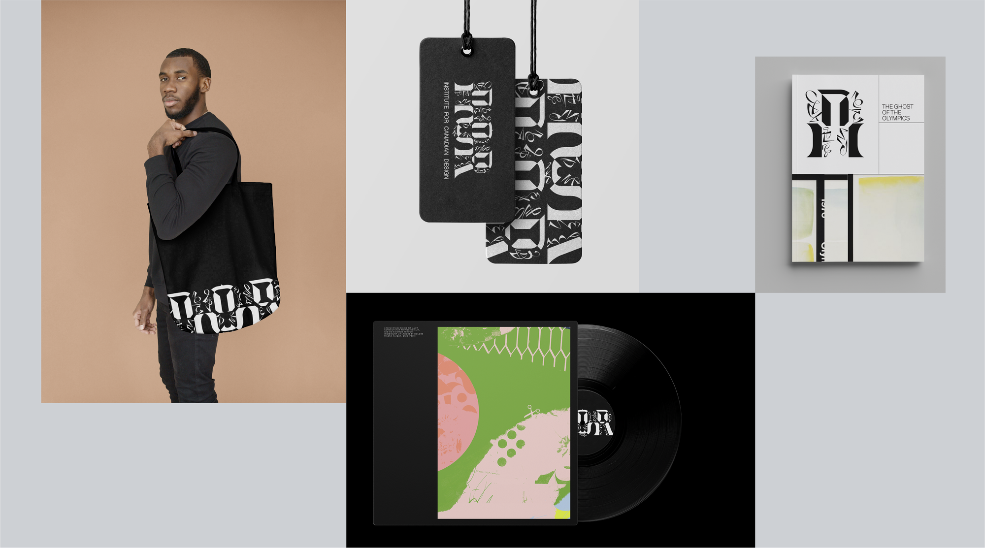
The final zoom call. Mockups settled, albiet impractical.
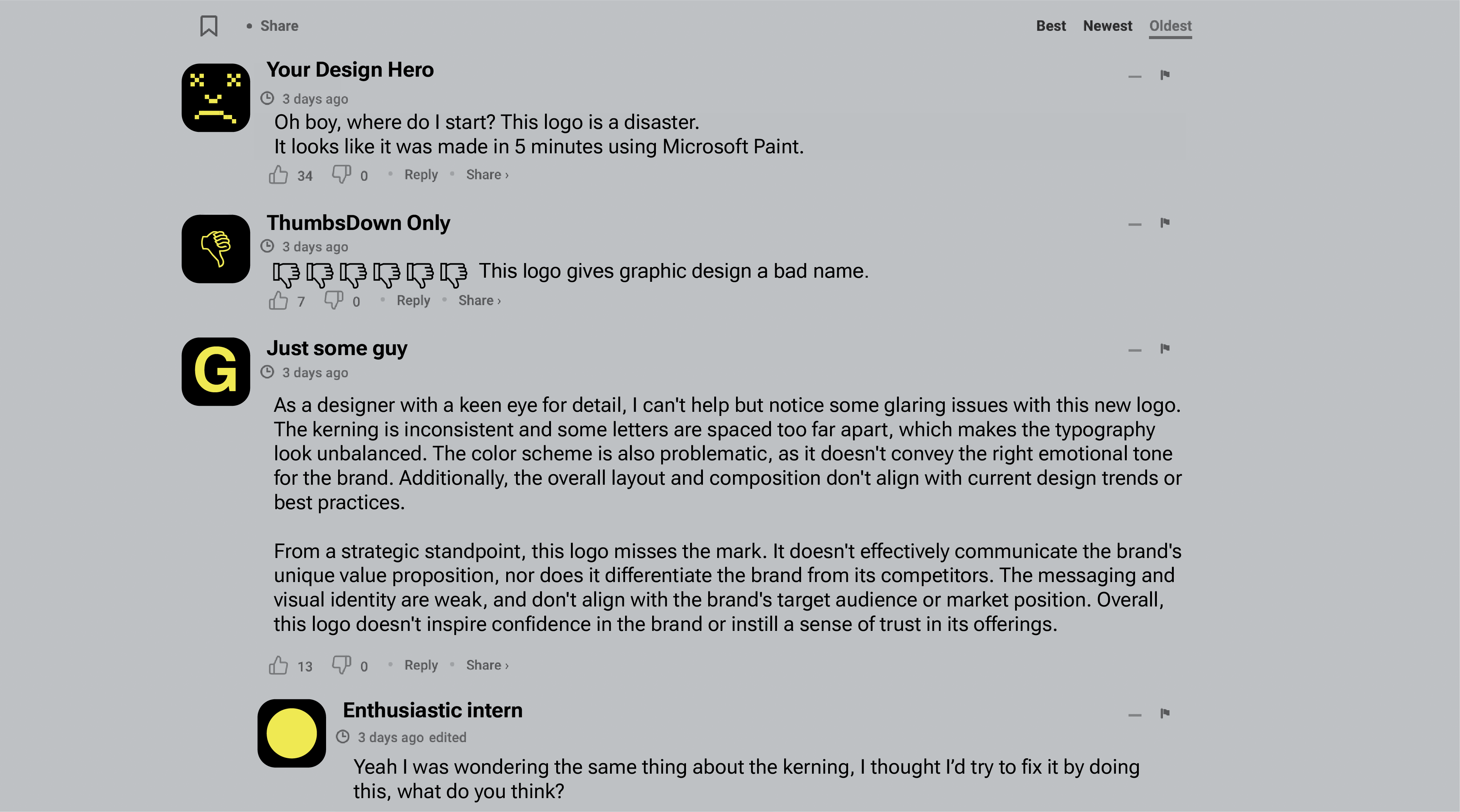
“Guys I showed this to some of my designer friends at drinks last night. They don’t know what the fuck to make of it.”
A pause.
“Does it need a maple leaf?”