
Right of passage: Unpacking the new Canadian passport design
What deeper meanings are woven into the fibres of the new Canadian passport?
“While securitization is the passport design’s primary function, its secondary function is articulating aspects of the national imagination. It tries to tell a story about the place that its holder comes from, and why such a vast spatial territory like Canada is even coherent as an idea.”
Whenever there’s a new design of money or a passport, there is always a particular kind of excitement, especially within the design community. I recall the hype around the design of Norwegian paper banknotes. With their minimalist/modernist affectations, the design seemed to suggest to some designers that perhaps there was still something meaningful to be done with our vocation. The traditional/modernist mandate to unburden the world of regressive signifiers (of authority, monarchy, ancient and mythological ideas about nationhood) scored at least one recent victory. Discourses around “problem solving” in design (while avoiding the question whose problem?), and an endemically modernist orientation, usually means that design is associated with progress—it “makes things better.”
Such moments serve as reminders. Such banal articles as money, passports, and other kinds of official documents—which usually rest unseen in your pocket, bank account (not really1), or desk drawer, only to be called upon in moments when one has to prove that they can pay2, or are allowed to traverse a fictional line on the ground—were always designed in the first place.
In May 2023, the government of Canada introduced an updated passport design. The webpage announcing the new design states that this is a routine process, perhaps even an opportunity for progress. A YouTube video with rousing yet restrained orchestral music demonstrates the various graphical security features of the new design, narrated with subtitles. Its message is “New is better, but let’s not get too excited.” Anglo-Saxon-Canadian propriety notwithstanding, the idea with the redesign is simply to align Canadian travel document production with “the International Civil Aviation Organization’s (ICAO’s) best practices and standards.”
Canada—that world-peace-keeping, environment protecting, multiculturalism promoting, scientific innovating, universal-health-caring nation— may be one of the world’s most astute makers of propaganda. We can glean hints of this aptitude from bureaucratic genres of communication design. Their qualities and content represent just the tip of the iceberg when it comes to unpacking the ideological work that goes into “designing” a nation. To be sure, the rhetorical conceit here is not to suggest that graphic designers design nations. It is rather to suggest that states (their bureaucracies) have an imaginative, poetic capacity to create them.3 An insight and a question follow: Nations are designed things, designed things have agendas/functions. What is the agenda of nation building?

At the outset, we must first understand that a (nation) state is a bureaucracy that makes and governs schematic claims about the world that ultimately requires (the threat) of violent enforcement (policy needs police). The late anarchist and anthropologist David Graeber suggested poignantly in his book the Utopia of Rules that police are in effect bureaucrats with guns. One of the schematic claims the state makes about the world is the extent of its sovereign territory. That is, the extent of its claim to be the manager (“sovereign,” “custodian,” “steward,” “father,” “mother,” etc.) over some part of the earth. This is articulated, graphically, of course, by a line on a map. This line does not necessarily represent any factual phenomenon on the ground itself. It is rather a graphical projection, and a radically contingent one at that. Borders only attain a meaningful degree of reality when someone (usually someone with a gun) is there to police the claim imposed upon that space. In other words, no gun, no border, and no basis of functionality for the passport.
For people attempting to exercise a fundamental right to move through space, securitized borders frustrate the desire to get where one is going. Confronted with this condition in a very direct way, one would have, at the very least, a desire to resist. If one is willing and able to physically resist, that’s when people get hurt, or worse. The constant deployment of violence to suppress leaks in policy dictums (i.e. “no coming over here from over there without a paper w/ your name, picture, etc.”), would increase political volatility. To this day, it’s a bloody and expensive endeavour.
The economically efficient and politically palatable solution would be to deploy “sleeping policemen” (aka “silent cops”) that raise barriers to subverting otherwise contingent border claims. Having a legitimate passport (recognized as such by an armed official) can head off a direct confrontation when one tries to exercise one’s right to traverse space. But let’s also be sure, the passport is not simply a discrete object, but co-constitutive of the bureaucratic systems within which it circulates. The system of nation states and their attendant borders give these papers meaning, and these papers mean little without the armed border officials to recognize them as such.
To reiterate, the passport itself is an unstable, contingent claim—it says, “this is a passport,” and it allows its holder to legitimately traverse other border claims—depending on its recognition by a border officer. As such, it also needs some kind of securitization, because, well, right next to me, I have a piece of paper that has written on it: “This passport allows me, ________________, to go anywhere in the world at any time.” Practically the same message as an official passport, at least from the perspective of the traveler, but completely illegitimate as a claim. This is where we begin to see design and aesthetics function politically.
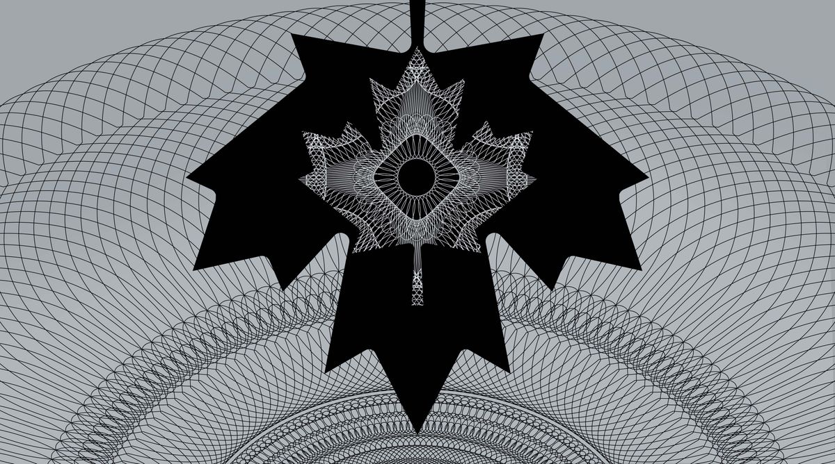
Besides the aesthetic affectations of securitized bureaucratic documents, there are certain technical-production features that enhance the defense of the claim and declare “this is an official passport.” Such features help deter the circulation of “illegitimate” counterfeits, and assure armed bureaucrats stationed at lines on the ground in their task of discerning the legitimacy of the document. The video released by Service Canada lists 27 new security features—production processes guarded by the Canadian Bank Note Company (which also prints, as its name suggests, other securitized documents like bank notes for Canada and other countries). The presence of these not only makes the production of counterfeits difficult, but they also give the passport design’s primary audience confidence that the document was officially, legitimately issued, by virtue of the fact that its visual and haptic qualities are not arbitrarily accessible except through exclusively commissioned printers.
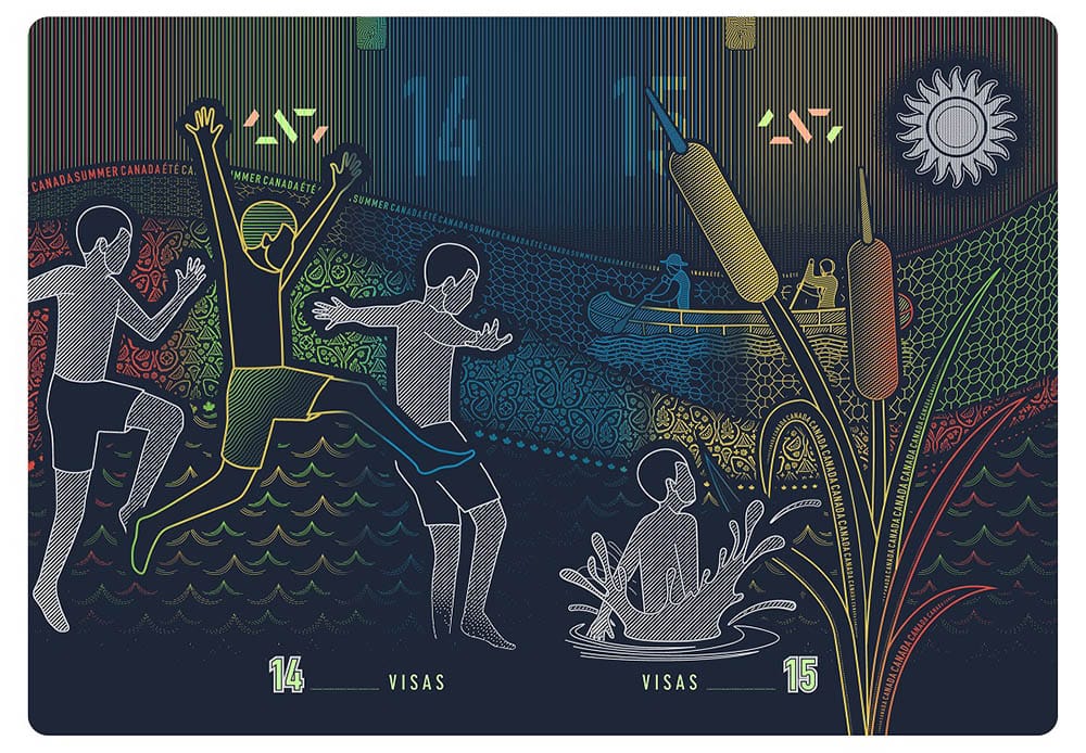
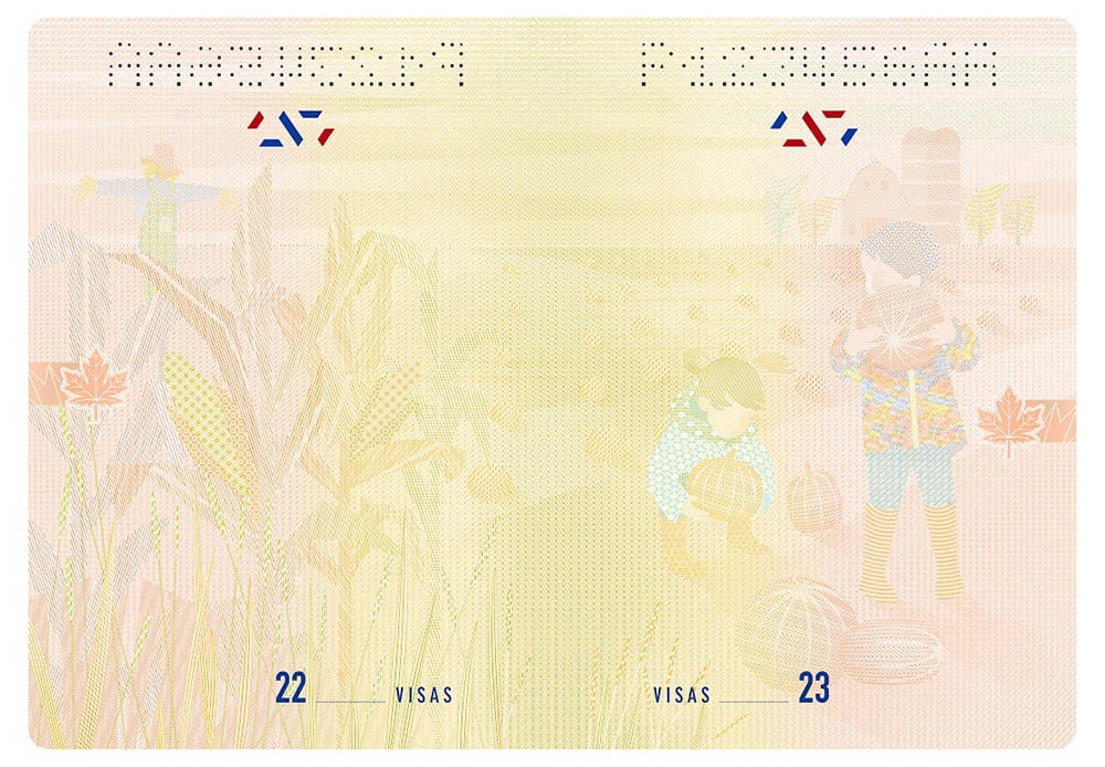
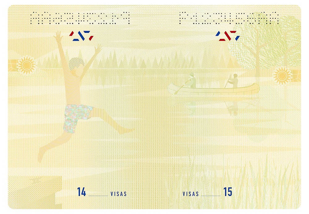
While securitization is the passport design’s primary function, its secondary function is articulating aspects of the national imagination. It tries to tell a story about the place that its holder comes from, and why such a vast spatial territory like Canada is even coherent as an idea. We see, again, from the video preview, a number of visual, pictorial motifs: snowflakes, maple leaves, various flora and fauna, rural landscapes, urban landscapes, wilderness, and so on. The visualization style takes on a reductive, illustrative approach. In one spread, we see an adult bear present in a forest scene with two cubs. In another, we see a child jumping playfully into a pond. The animals have facial features, but the people don’t. They are rendered as nondescript figures. This is in contrast to classical examples of images that mythologize national character—monumental achievements, conquered territories, fallen heroes—all the things that were built, and all the people who sacrificed for “us.”
A powerful animal, caring for cubs, a stalk of corn, snowflakes, plants and non-racialized children playing with a gourd say everything about how Canada’s ideological defense is built on playing the non-threatening, non-controversial, nice version of the United States. The social sciences have a word for what’s going on here: “schizmogenesis,” which is where social/political distinctions are made by saying “we are this because we are not that.” This is akin to how scholars in whiteness studies understand whiteness, not as a political category based on any visual, or even biological/genetic criteria, but rather as a strategy of authority—a defense for arbitrary power—by also declaring “we are not that” (where “that” is wrong, bad, deviant, backwards, uncivilized, etc.).
Another word we could use for what’s happening here is “designation.” And that’s only maybe because, well, we’re talking about this in the context of design. But the point is that such objects design an “us.” Perhaps the most poignant contemporary example of this is the design of the Euro banknotes. The bridges depicted on the various denominations are not in fact existing bridges. Rather, they are archetypes of bridges from around Europe that connect the broader territory. Their design, like the faceless figures in the Canadian passport, were meant to evade the controversy of privileging the representation of one group/place or another, and thereby aid in maintaining the claimed legitimacy of the European project.
Canada’s image in the world is overwhelmingly positive4. It is known as a peacekeeper, steward of vast natural resources for recreation, and a haven (at least since the 1960s) of multicultural tolerance (see also Richard Day’s critical take on this colonial-ideological pillar in Multiculturalism and the History of Canadian Diversity). But when we also know that Canada is a fiend to the Indigenous people of Turtle Island, to those stranded in conflicts in the Middle East, to those who resist resource extraction in South America, we see more clearly the need for a design that says in the most Canadian way: “US=GOOD; THEM=BAD JUST NEED A LITTLE HELP FROM US, EH.”
The essential ideological work here, embedded like fluorescent microfibers, is the banal reproduction of the idea that the settler-colonial state called Canada is itself a legitimate entity—one that can permit or prevent people to leaving and entering—and not one born out of the foundational crime of displacement, and genocide, and the kind of colonial settlement that, participating in a global system of nation states, lead to the establishment of its own formal borders.
Rather than celebrating, or even leaving with scoffing at the new design, I would propose that this presents as an opportunity to initiate a more substantive conversation examining the profound efficacy of Canadian propaganda and the role of design in all this. Or, at the very least, the design field’s capacity to grapple with what it does and does not do to “make things better.”
- Canadian banks are one of the few in the world that do not have a reserve requirement.
- Money is rather (ostensibly) the proof that one has contributed something to the economy/society.
- See Benedict Anderson’s Imagined Communities: Reflections on the Origin and Spread of Nationalism.
- This could be attributed to several things, but those of us who were educated (indoctrinated) in Canadian public schools know all about Canada’s history as a peacekeeper, its vast natural resources (and stewardship), and the official policy of tolerance and multiculturalism.